
Foodways Bakery
Fall quarter of my second year studying architecture at Cal Poly, I designed a bakery and community center in Guadalupe, CA. The design is inspired by a slice of ciabatta bread and my process included a loooot of model making! It was such a fun quarter and I learned so much.
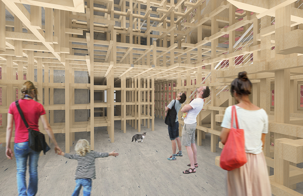 When you enter the building, through the ceramic “crust” facade of the building, you enter the lobby which has a skylight up to the top of the building. The exposed Kengo Kuma-esque wooden structure mimics the texture of the air bubbles in a slice of bread.
The first floor has the lobby, bakery storefront, and a sitting space. In a detached building behind the main building, there is a gallery space and a wheat field behind that in the long, narrow site. The second floor of the main building is the bakery and the third floor is an apartment for the caretaker.
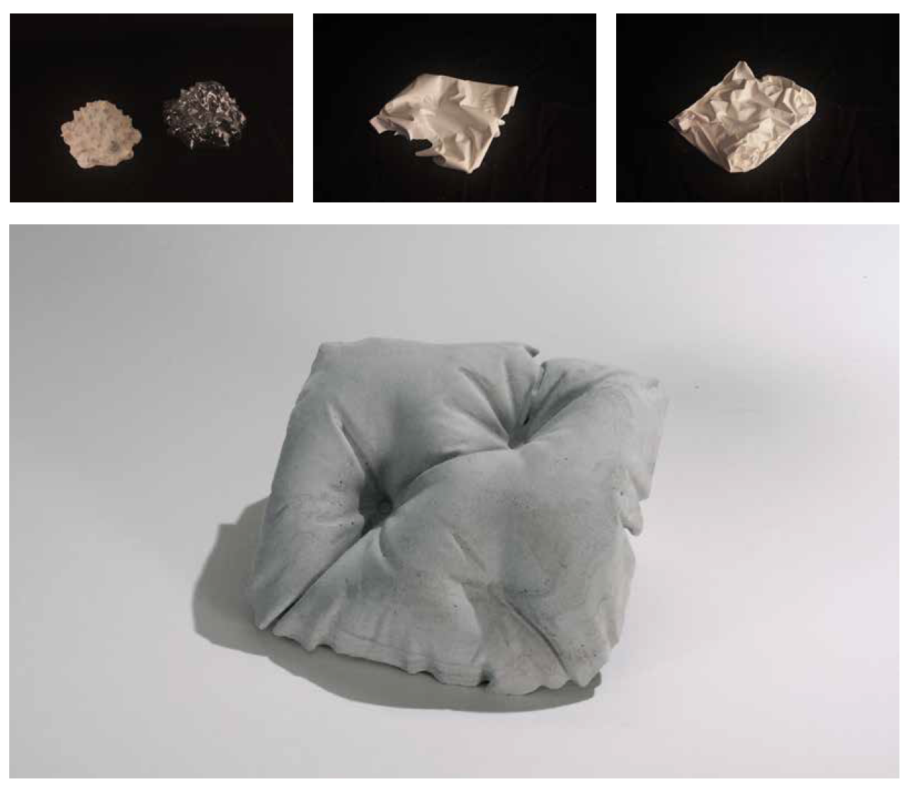
Above are study models of the facade materiality. I started (top left) by vacuum forming a romanesco cauliflower (a unique vegetable with a natural fractal pattern) and then casting it in Rockite. While interesting, it didn’t work as a facade tile. Next, I cast plastic bags in plaster which created very interesting geometries but wasn’t as square as I wanted. Finally, after being inspired by a project at Cal Poly’s annual Vellum furniture show, I created a fabric cast, pillow-like Rockite model. It’s not the perfect solution, I wish it was more square and had gentler curves but it’s what I ended up with.
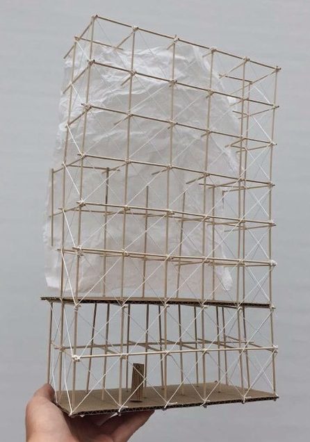
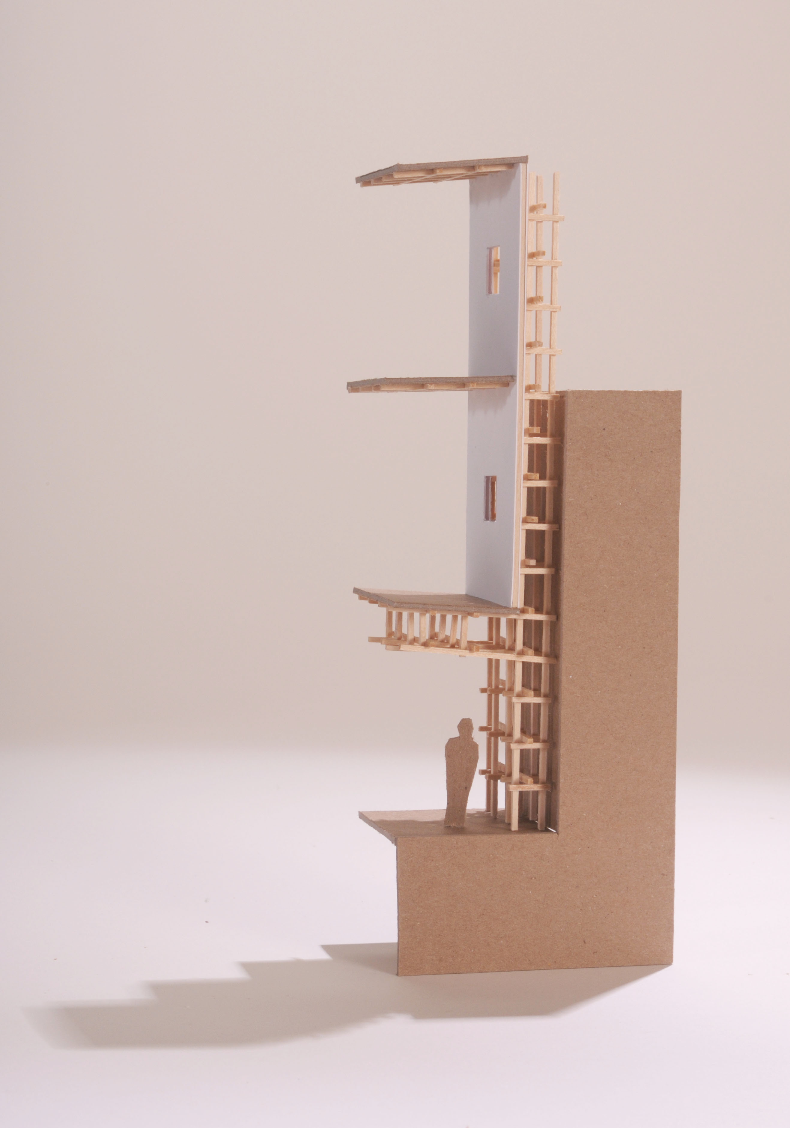
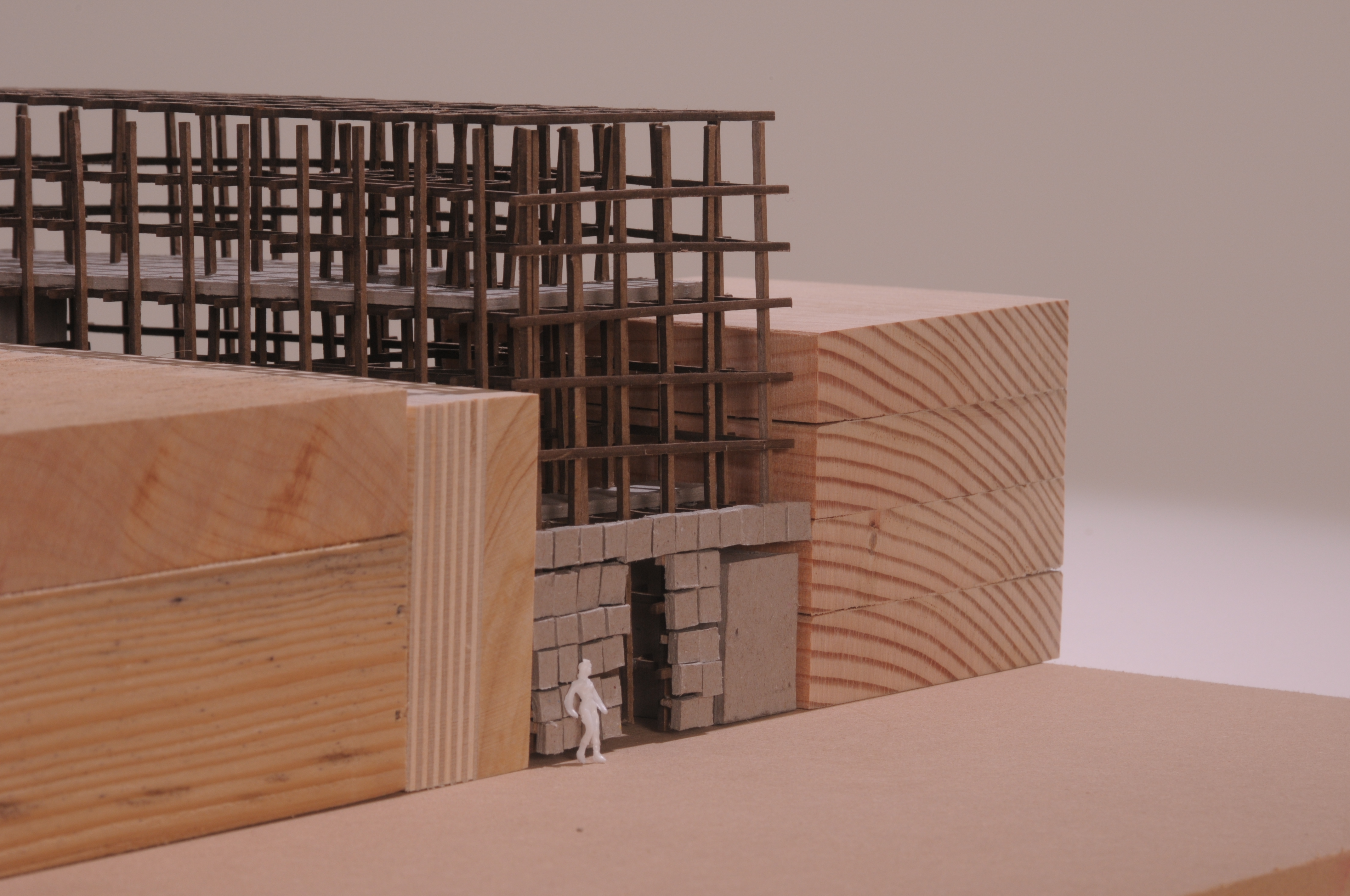
The details of the wooden grid were important to me in this project. The early study model on the left shows how fabric could be used to enclose organic volumes of space within the rectangular grid. The later study model on the right shows a light shaft between the neighboring building and the proposed upper floors that lets light into the ground floor.
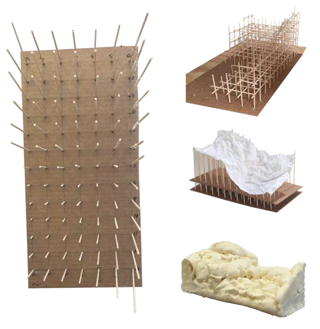
As another geometric investigation, we each mapped a surface on our bodies. I mapped the curve of my hip. I modeled it a variety of ways, with sticks, fabric, and foam, and then modeled it in Rhino (below).
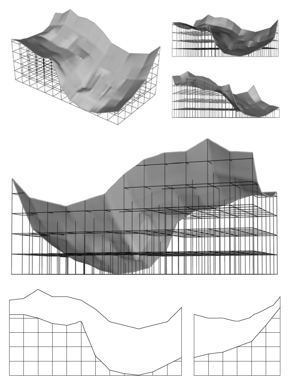
This geometry was used to create the voids in the lobby, sitting area, and gallery spaces. Yes, it is arbitrary to use the geometry of my hip as the form for spaces in a bakery, but it was an interesting challenge and you have to start somewhere.
If walls could dream… they’d dream of fresh baked ciabatta!

Habitat for Humanity Dream Community
I had the great pleasure of working with Habitat for Humanity and a group of 5 other Cal Poly students to design a “dream community.” We picked a site in San Luis Obispo that we think would be a viable option to build affordable housing on and then designed the site plan and floorplans for a prospective 30 unit neighborhood.

We picked this site off Johnson Ave for its views and relatively flat and undeveloped landscape. The site is next to an existing community garden and a bus stop for easy access to public transportation. It is only a short drive from downtown San Luis Obispo and within walking distance of hiking trails and a grocery store.

We fit all 30 units onto our site and decided to give them smaller backyards to allow for a community park area where there could be a playground or a barbecue area that would provide a sense of community. Every house has a front porch so when you’re driving to work you can wave hello to your neighbors reading their newspaper and drinking their coffee or walking their child out to meet the school bus.
The houses are all what planners call “zero lot line houses” which I hadn’t heard of before now. It means the houses sit right on the lot line on one side, giving them a larger yard on the other side instead of just two narrow strips of land on either side. The houses also have their garages in the back off an alley, creating a more welcoming and walkable streetscape. The houses themselves have an open plan kitchen and great room on the first floor and three bedrooms on the second.
This project was a great opportunity to see what it’s like to design a neighborhood from start to (almost) finish and to get to work with students from other majors and different years (we had everything from a 2nd year mechanical engineer to a 4th year city and regional planning major.) Habitat loved our design idea and it was a pleasure working with them this year.
If walls could dream… they’d dream of designing a place where community blossoms.

Film Photography

My new old toy, a Rolleiflex camera that shoots 120 film. I started using it this quarter and have developed a few rolls in the architecture department dark room. It’s super fun and hipster and I’m really looking forward to using it in future projects! Here are a few of my favorite shots:


Wall Show

Here’s my wall on display. I wanted to share some of my peers’ work too. I was amazed by the range of materiality, form, and ideas that everyone came up with from the same prompt. While there were a few that broke the site and ramp/stair slope guidelines we were given, overall they all turned out really well.


The Wall
The final project of freshman year: a wall. While it was a bit anticlimactic, this was still an interesting project. The idea was to question what a wall really is. Is it about separation? Is it more than just some 2×4’s covered in drywall? Is it more about verticality or horizontality? I’ve been dreaming about walls for years now, this should be an easy project right?


We were also given a site for our wall, an “exterior” side, a stem wall, and then an “interior side” one foot higher. We had to have stairs and a ramp of a certain slope on both sides, so I started by laying those out at a small scale to determine where the opening in my wall had to be.

I constructed a base for my final model out of mdf as I worked on the design of my wall.

The main concept for my wall was a door that swings down to be the ramp on either side of the wall. There’s a video at the end of this post with the final door in action. After I had worked out my door and my ramp/stairs, I got to work on the surrounding wall.


Inspired by Peter Zumthor’s Swiss Sound Pavilion, I decided to make my wall out of vertically stacked strips of basswood with a small spacing in between them. To make the door/ramp work functionally, I designed a pulley system that could be operated from either side of the wall which in turn dictated the openings I had to make in the wall.

Wall in-progress. Pro tip: use double stick tape to lay out your beams perfectly and then glue the vertical support onto them all at once instead of trying to line up each one individually.

Here is the finished wall. You can see the custom base, ramp and stairs, horizontal wood siding, sheet metal ramp/door pivot mechanism, and the openings for the pulleys and ropes.


Here is the door/ramp going from ramp on one side to door to ramp on the other side.


Plan and section of the wall.

Siding pattern detail

Pulley detail

Metal threshold detail
If walls could dream… they’d dream about walls of course!

Middelboe House by Jorn Utzon
For a nice change of pace after Design Village, our next project this quarter was a research project about a house. I was assigned the Middelboe House by Jorn Utzon. Having dreamt about researching something famous like the Fisher House or the Robie House, I was a little disappointed at first by this obscure Nordic home.

However, as I researched this house I started to fall in love with it. Utzon is best known for being the architect of the Sydney Opera House (below left) and has done some remarkable work throughout his career. In this house, he really experimented with materiality and structure in a modernist grid. The columns and large glass walls are reminiscent of Mies’ Farnsworth House (below right).


Our assignment was to diagram every aspect of the house – structure, program, circulation, etc. – in order to understand it and then we presented our research to our class.

I started by looking at the program (the arrangement of the different living spaces) of the house. The diagram above simply labels each room in the house. The first floor plan is on the center left and the second floor plan is on the center right and the four elevations are arranged around them. (You can click on the diagram to see it larger and zoom in.)

This diagram color codes the outdoor, living, bedroom, and bathroom zones in the house.

And then this one gives a 3D view of the three main zones of the house: outdoor, sleeping, and living, and how they fit into each other like a puzzle.


Next, I analyzed the structure of the house. Utzon highlighted structure in his design, color coding it himself. The black elements are concrete beams and the red is the secondary wooden structure. The house was inspired by Asian construction techniques and relies on gravity instead of nails and screws to hold the house up.

This section diagram shows that black and red structure that Utzon displayed so proudly in his house.

This diagram builds on the black and red structure to categorize all of the walls in the house.

This next set of diagrams illustrates the house’s relationship to its site. It is located next to a canal in Denmark which provides a beautiful view but also a privacy concern. Utzon addressed this concern by moving the bedrooms to the back of the house, away from the river to give them privacy. He also sited the house in between the two large trees on the property for shade and added privacy.

The circulation through the house is all focused through the central stairwell and then up into the living spaces. This was my favorite diagram to make and I’m really proud of the way it turned out.

Finally, I made a collage diagram of what it would be like to be inside my house (see Mies’ collages for inspiration). I used the Rhino model I had made to get the linework for the interior perspective and then added the landscape through the windows. I chose to leave the interior white to focus on the view and the shapes that the structure makes with the windows – even though they are all rectangular openings, the perspective and the added beams create dynamic trapezoids.
All in all, this project was a good change of pace and a good way to connect the dots between a very abstract yet personal experience of a dwelling with Design Village and the more conventional yet still architecturally advanced ideas of what a house is to famous architects.
If walls could dream… they’d dream of being in a famous architect’s masterpiece.

Drawing Haus

Drawing Haus was the last project of Winter quarter. It was all about creating a space where you could relax, think, and draw.


I made the model out of layers of cardboard.


The corrugation allows light into the interior of the model and casts interesting shadows.

If walls could dream… they’d dream of having a personalized space to draw.

paraSITE 2016
My finished paraSITE project:

Viewports to mountain peaks:


Joints:


Check back soon for more about my process and to see the other projects!


Sheet Metal Tetrahedron
Also inspired by the primitive shapes, we made a sheet metal model of a shape that had been sliced to create voids and compartments within the shape. I picked the tetrahedron and sliced it twice to create an L-shaped piece.

Drawings showing the assembly, surfaces, and volumes of the shape.

Finished sheet metal model.

All connected with spot welds.
If walls could dream… they’d dream of metallic geometry.

Secret Compartment Cube
After making our primitives, we were put into groups to construct a cube with a “secret compartment” inside. The cube was to be made out of wood and a focus was to be put on the assembly of the cube and the process of making it.

The pieces of my subsection of the cube.
Our subsections coming together to form the whole cube.

Detail of the line weight.

Study models of my subsection.

My finished and stained cube subsection.


Final assembled cube.
If walls could dream… they’d dream of secret compartments.